Last month, I released the paperback version of my historical short story collection, The Wherryman’s Daughter. Just as I felt with my romance novel, The Bride Who Rode In With The Storm (published by Satin Romance), everything feels worth it when I finally get to hold the physical version in my hands.
The Wherryman’s Daughter is a self-published effort. It
wouldn’t look half as good without the gorgeous cover art by Marcia Dye. While I was sharing the
work in progress on Twitter, I was asked the steps on how to prep a cover. I
decided to do a blog post on how I did my paperback cover for Amazon, along
with what went right and wrong.
Blogger sometimes affects uploaded image quality, so if
anything looks blurry, just click on the image and it will show it at its
original size!
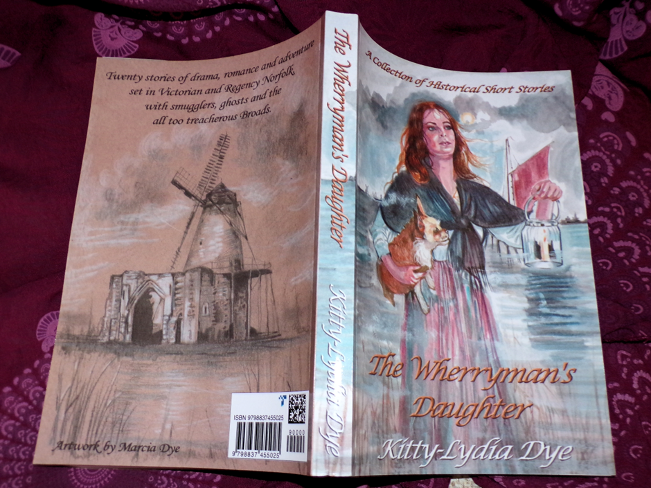
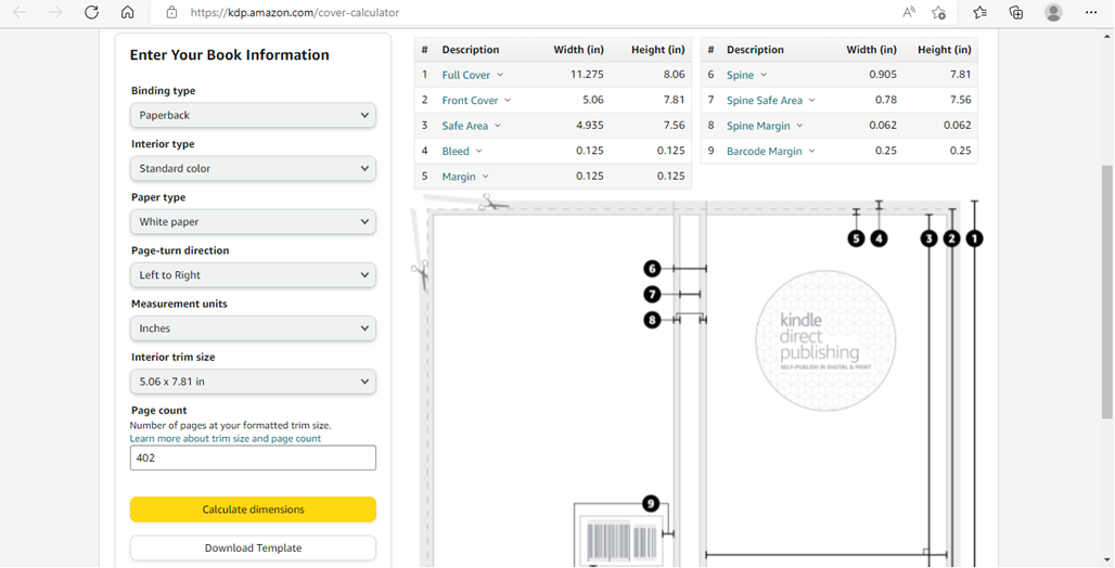
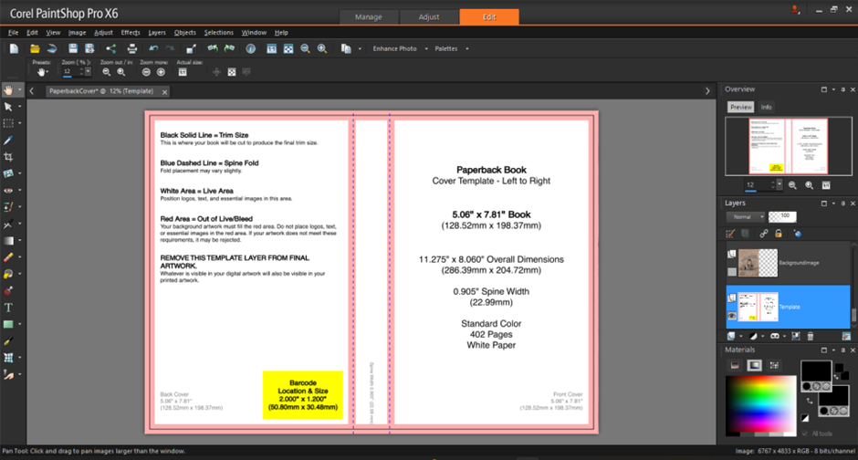
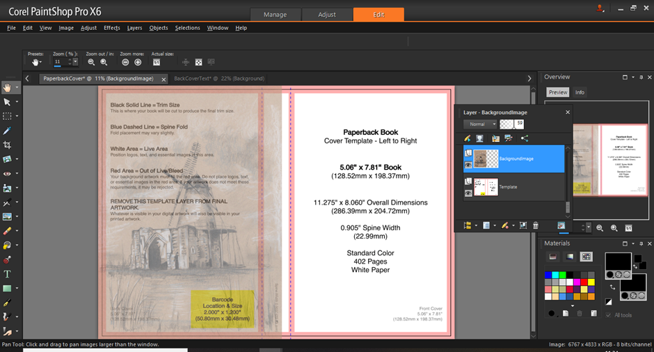
My final paperback version of The Wherryman’s Daughter ended up being 6x9 inches with 294 pages as I wanted it to be a large print version. Originally, I planned on it being a smaller book, the following screenshots show this, but the steps still apply whatever size you decide on. The photo editing software used is Corel Paintshop Pro X6.
First, I went to the cover calculator on Amazon KDP and inputted my details. You should already have your trim, text size, headers and footers etc complete for your manuscript’s PDF so you know how many pages the final product is. The cover calculator will create a downloadable template in PDF and PNG.
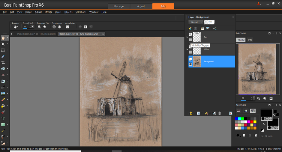
I start with the back cover. Earlier, I wrote the text and cropped
my image, but now I decide to change some things (and realise I’d somehow
forgotten where the barcode would be placed!)

Luckily, this is an easy fix if every element is on a
separate layer. I open the original image, but, rather than select everything,
I hide the text by toggling the visibility – the eye icons – on the layer
window until only the artwork remains.
This is then copied (under the option copy for professional
printing).
Move back to the template file and paste as a new layer. Lower
the opacity for this layer to 50-60 on the layers tab so it is easier to align
to the margins.
Back to the original back cover file, I change the text
positioning, set the visibility icons so only the text remains, which I
highlight with the selection tool and then copy and paste into the template
file.

I also do this with the art credit, using the pick tool to
adjust text sizing.

The same thing is done for the front cover.


Now on to the spine, the bit which stumped me the most. Other
book spines have wrap arounds or a strip of plain colour with a small icon. Do
whatever you feel most comfortable with. What I did is crop some of the art
from the original cover and then stretch it over the spine margins.

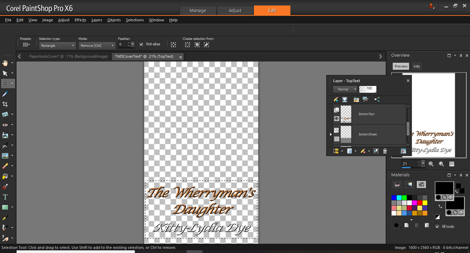
More issues! :D I want the spine text to be on one line and
smaller, so I try editing the text for the original cover file. For some
reason, I must have applied a lot of edits as it simply refused to be changed
and I couldn’t remember what font/styles I used. Instead, I select “The
Wherryman’s” and copy and paste, then select “Daughter” separately. This can be
seen on the layers tab.

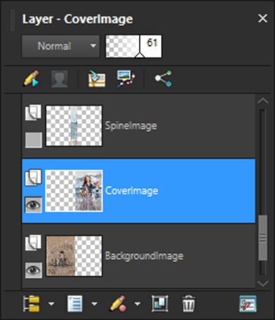
Something to note, layers are ordered in terms of what goes
on top of what. I’ve kept my front and back cover layers under the spine layer,
so the spine image will cover any white spaces in between and stop any random
borders. What needs to be absolute is having the text higher up on the layer
list before any of the images. If they are accidently placed lower down, the
images will hide them and you’ll lose your text.

Delete the template layer. We no longer need it.
Restore 100% opacity to the images.
Then merge layers


And it’s done! But not quite yet. Amazon requires paperback
covers to be uploaded in CMYK and PDF. CMYK is what printers use, a JPEG using
RGB (which is what most online pictures are) isn’t good enough as the colours
will be too dark.
I save the file as a TIF, which allows it to be saved in a
CMYK colour profile.
I used Word to convert the TIF to a PDF. Open a blank Word file and change the orientation to landscape and the size to the dimensions of the cover file. I then insert the picture and stretch to fit – don’t leave any white edges or else Amazon will reject it – and then save as PDF. Do not tick the PDF/A compliant which appears under options.

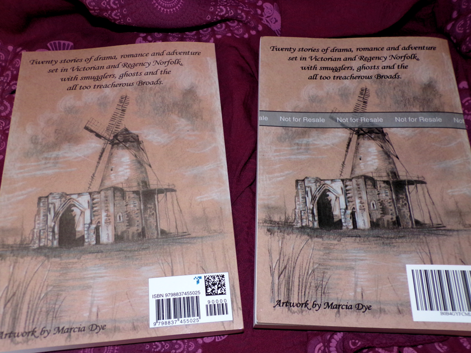
After uploading the manuscript and cover on Amazon, I could
order a proof copy. (Proof copies cannot be resold, they’re for checking if
everything is correct). On the right side is my proof copy and on the left is
the actual Wherryman’s Daughter, which readers will receive from Amazon.

Reading through the proof copy, I found a few issues with
the headers and spacing. Mum (Marcia Dye) and I also felt the cover was a
little too dark and wanted something softer.

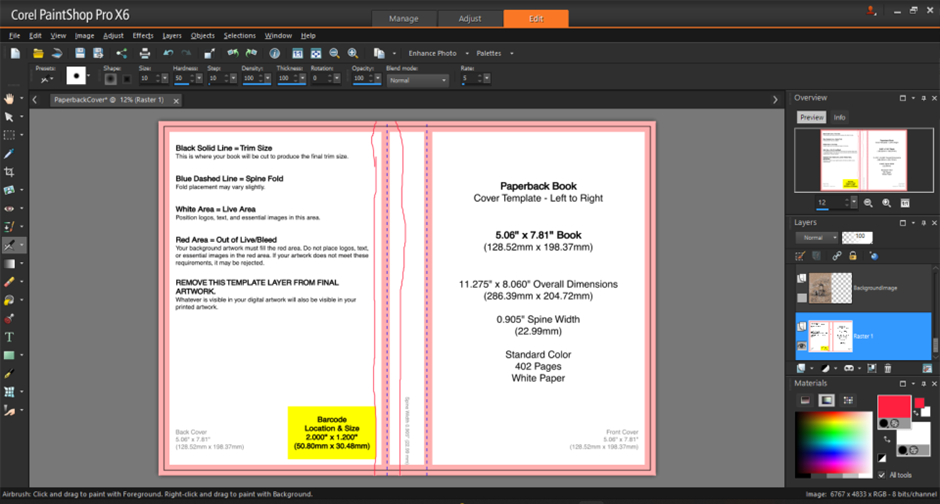
Something I messed up the first time around – I thought the red margin near the centre (highlighted) was for the back cover but it is for the spine. If you want a separate image to cover the spine – get this margin covered.
I made my fixes, resubmitted to Amazon, and here is the
finished product!


I actually quite enjoyed doing this post. I might do some
more in the future about the writing process (although I’m going to have a long
break before I attempt another paperback!)

Thank you so much for sharing this process Kitty! Very generous! I am not sure that I would have the technical skill to do this. It sounds very complicated. You’ve done a fabulous job. ( Julie)
ReplyDeleteThank you :) The main thing is having patience, especially as my editing software is about ten years old so it often crashes. There were plenty of times I ended up storming off!
Delete